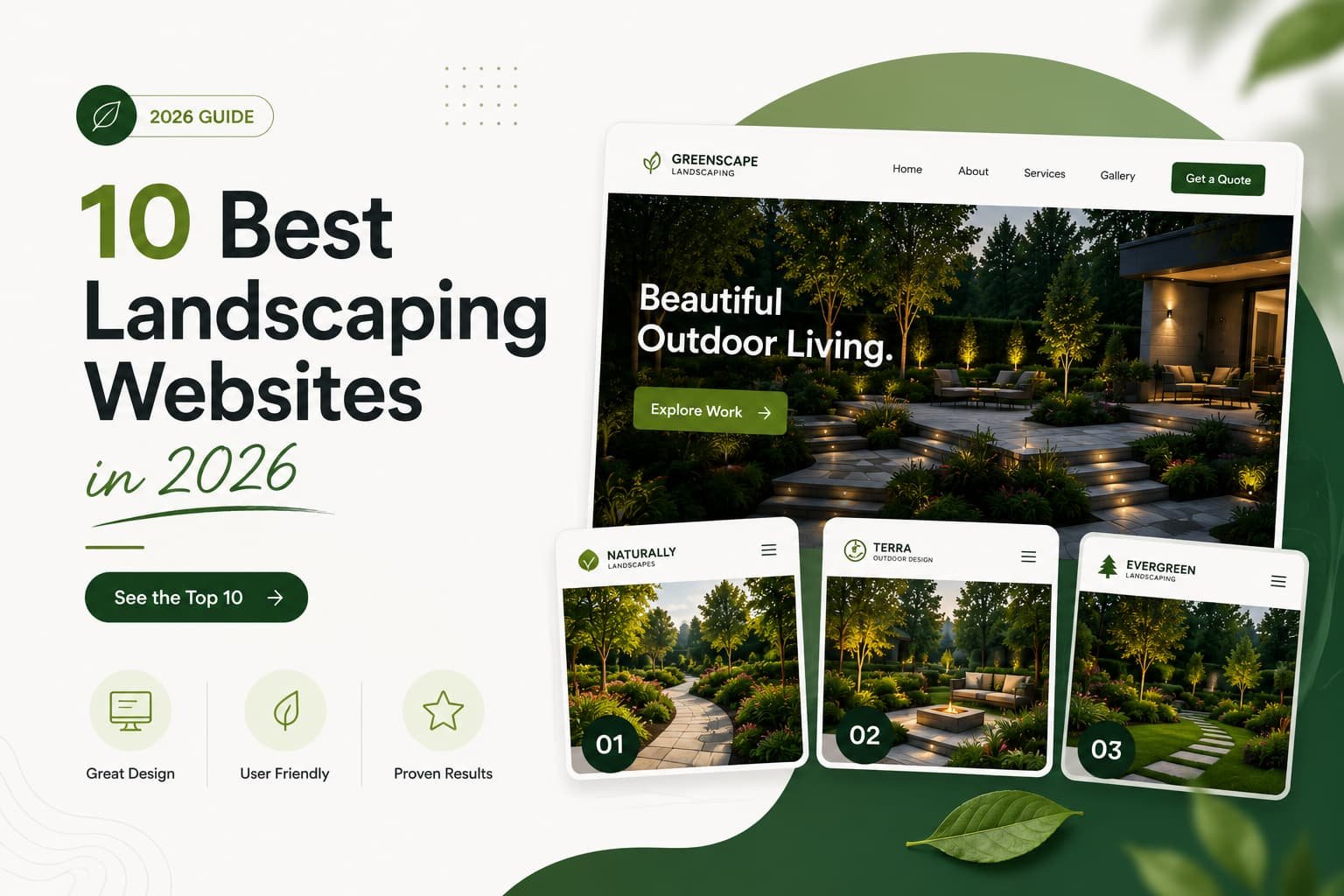
These are the 10 best landscaping websites 2026 has to offer — not just the prettiest, but the ones with the portfolio layouts, trust signals, and CTAs that actually convert homeowners into estimate requests. Here’s what makes each one work.
Most “best landscaping websites” lists just admire pretty homepages. This one’s more useful. We build and study these sites for a living, so instead of picking on looks, here are ten patterns that show up again and again on the sites that actually get a homeowner to request an estimate. Not the prettiest sites. The ones that work.1. Leads with the transformation

The strongest homepages open with a stunning finished project, not a stock photo or a wordy tagline. Landscaping is visual, so the best sites put the work first. You see what’s possible in the first second.
Steal this: let your best project be the first thing on the page.
2. Before-and-Afters That Sell the Dream

3. A Portfolio You Can Actually Navigate

Great portfolios are organized by project type, patios, full landscape design, outdoor living, gardens, so a homeowner picturing a paver patio finds it fast instead of scrolling past mowing photos. Easy browsing keeps the highest-intent visitor engaged.
Steal this: sort your portfolio by project type, not just a random photo dump in chronological order.
4. Project Pages With Real Detail

The best examples add context to each project: materials used, square footage, timeline. That small detail turns “that looks nice” into “I want that” and builds real trust with anyone weighing a bigger investment.
Steal this: add a few lines of real detail to your top project photos instead of leaving them uncaptioned.
5. Reviews That Prove You're Active and Local

6. A "Get a Free Estimate" You Can't Miss

Top sites place the quote CTA in the nav and the hero, plus a tap-to-call number in the header. Someone ready to act never has to hunt for the next step, whether they’d rather click or call.
Steal this: put your estimate CTA in at least two places above the fold, not buried at the bottom of the page.
7. A Crystal-Clear Service Area

The strongest homepages name the cities and neighborhoods served. It does two jobs at once: reassures local homeowners you cover them, and sharpens local search relevance. It also filters out the out-of-range leads that waste your time.
Steal this: name your actual service cities on the homepage instead of a vague “serving the local area” line.
8. Design/Build Shown as a Process

For design-build firms, the standout sites show the journey, a sketch or 3D rendering beside the finished install. It proves you create cohesive outdoor spaces, not just plant shrubs, which justifies a premium price.
Steal this: if you offer design services, show at least one project from concept sketch through to finished result.
9. A Commercial Section That Speaks to Property Managers

Sites serving commercial clients give them their own space, case-study-style pages with contract scope, acreage, and services, plus a “Request a Proposal” CTA. It speaks the language of HOAs and facility managers, not homeowners.
Steal this: if you work with commercial clients, build them a dedicated section instead of folding them into your residential pages.
10. Effortless on a phone

Most homeowners browse on mobile, often mid-daydream about their yard. The best sites load fast and let you swipe the gallery smoothly on a small screen, because a clunky mobile gallery quietly kills conversion on the most important page of the site.
Steal this: test your own portfolio gallery on your phone. If swiping feels janky or slow, fix that before anything else.
Frequently Asked Questions
What makes a landscaping website convert?
A strong, well-organized portfolio of real before-and-after projects, clear service pages, an easy “Get a Free Estimate” CTA on every page, visible reviews, and fast mobile performance. The portfolio does most of the selling, it’s the single biggest conversion driver.